AI Data Studio for the NESO Data Portal
Ask Britain's energy data anything.
PowerBoard turns 129 live NESO datasets into interactive dashboards. Type a question in plain English — the AI inspects the schema, writes the SQL, picks the right chart and builds panels you can edit, save and share. And it writes every one of them for you: control-room shorthand, a data scientist's caveats, or plain English with the acronyms spelled out.
Free AI credits when you join · Browsing the data is always free · No spam, ever · We only use your email to send your invite.
Already have an account? Sign in to the Studio
- No code, no drag-and-drop
- Live data straight from NESO
- Every chart shows its SQL
- Tuned to how you work
How it works
From question to dashboard in one message.
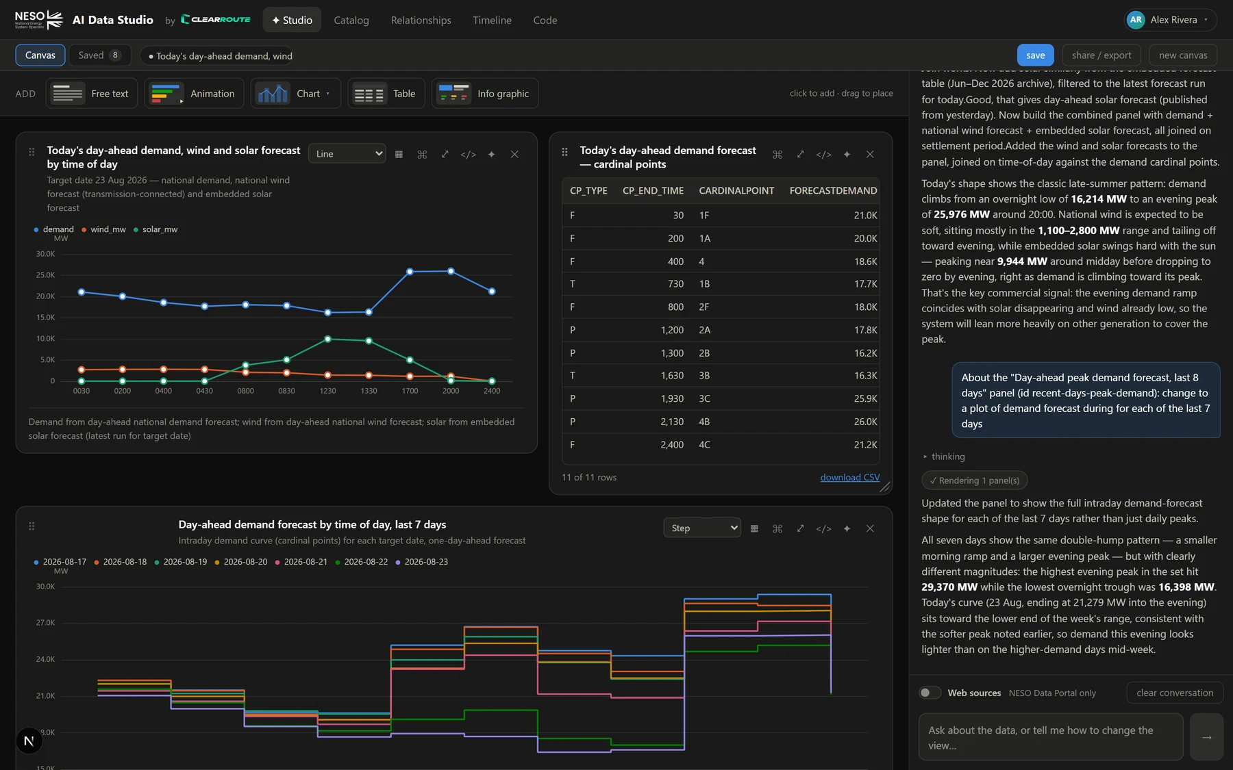
PowerBoard's AI is the primary driver. It doesn't just draw what you ask for — it reads the data first, so the chart form fits the values, and it writes the answer for the person asking.
Ask
"Show embedded solar and wind forecast for the next 48 hours as one chart, plus a stat tile for peak solar."
The AI inspects
It reads the dataset, profiles value distributions and sanity-checks its SQL against the live datastore.
Panels appear
Charts, tables, stat tiles and notes stream onto your canvas with a written explanation of what they show.
Refine, save, share
Switch chart forms, filter, flip to the data, send a panel back for refinement — then save the canvas, or export it as a web page, an Excel download or a branded PowerPoint deck.
Made for you
The same data, in your language.
A control-room engineer, a data scientist and a curious member of the public are all looking at the same grid — and none of them want the same answer. Tell PowerBoard who you are once, and every title, axis, summary and dashboard shape follows.
Seven questions, then it gets out of the way
When you join, PowerBoard asks what you do, which parts of the portal you live in, which horizons and numbers matter, how much industry shorthand you want and what a good answer looks like. Those answers ride along with every request — biasing the AI, never fencing you in.
- Terminology — plain English with BM, BSUoS and BOA spelled out, working knowledge, expert, or expert plus the SQL grain and caveats behind each panel
- Answer style — a headline and one chart, a rounded dashboard, a deep dive with the table underneath, or fewer panels and more written interpretation
- Focus — the datasets, time horizons, leading metrics and geographic grain it reaches for first
- Change any of it from the account menu at any time — and ask for something outside it whenever you like

One dataset. Three readers. Three briefs.
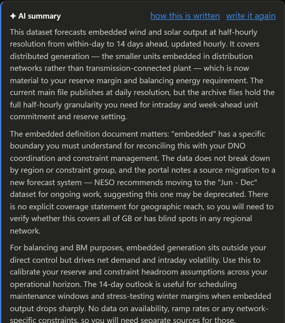
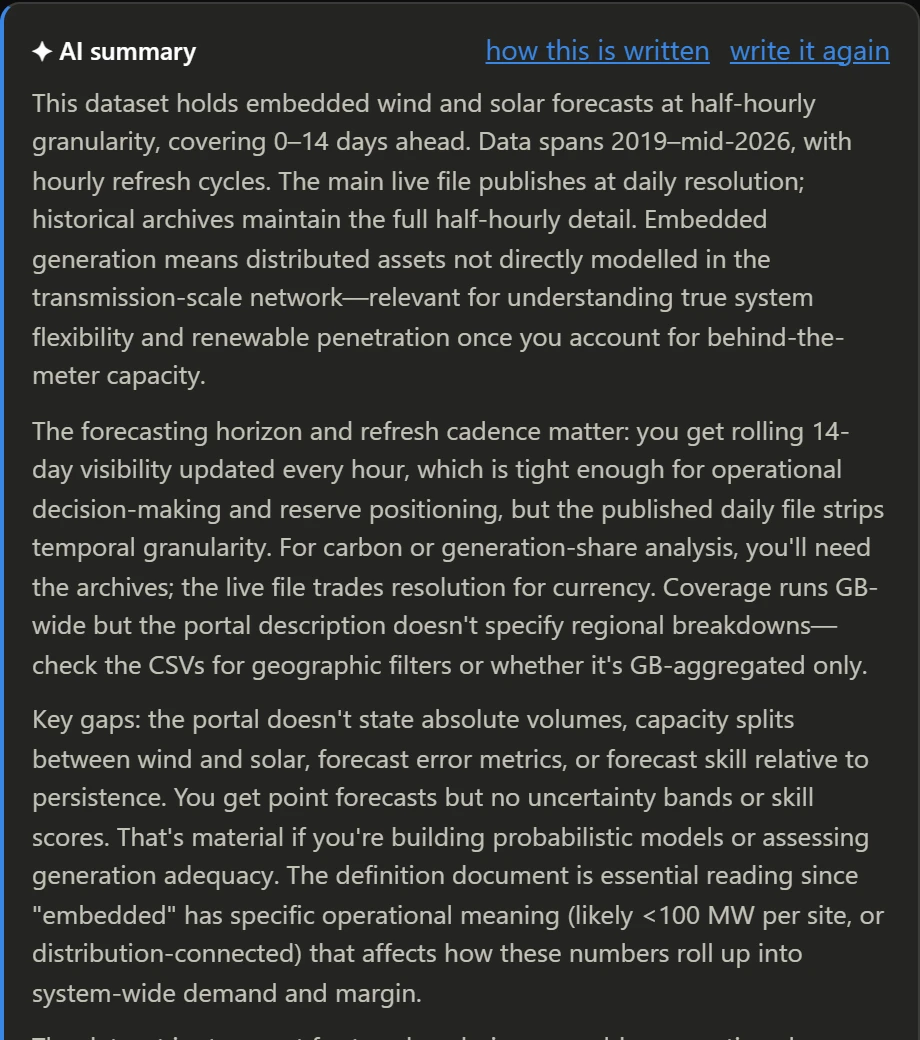
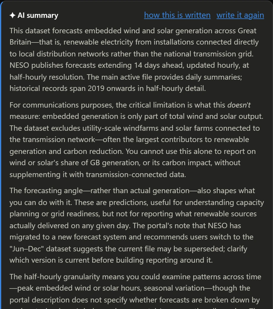
These are real, unedited AI briefs on the very same dataset — NESO's Embedded Wind and Solar Forecasts — written for three different profiles. Nobody changed the prompt; they changed who they said they were.
Control-room engineer
Data scientist
Curious member of the public
And you can overrule all of it
Your profile writes a starting instruction for the AI — you can read it, rewrite it in your own words, and switch each section of a dataset page on or off. Want the published notes gone and just the brief? The columns but not the preview? It’s a switch, and it follows your account between machines.
- Every detail-panel section is a toggle you own
- The AI-summary instruction is yours to edit — or reset to the one your profile suggests
- Briefs are cached, so re-opening a dataset costs nothing

Features
Everything you need to explore the grid.
Studio — chat with the data
Start with a suggestion or your own question. The AI builds charts, tables, stat tiles, animations, posters and notes onto a canvas, and keeps the conversation going so you can ask "why?" and "what about last year?".
- Drop your own empty panel from the toolbar — free text, animation, chart, table or info graphic — and the AI fills that exact slot
- Conversation and canvas persist across reloads; pick up a saved canvas where you left off
- Optional Web sources switch to bring in external CSV/JSON and web research — always cited

Every panel stays yours
Nothing the AI builds is a dead image. Change the chart form — fifteen of them, from line and area to sankey, treemap, calendar and gauge — flip to the underlying rows, read the exact SQL that produced it, resize it, hand it back to the AI with a note, or rebuild it as Python, TypeScript or SQL. Filter any chart by date window, series or category without touching the query — and download its data as CSV or Excel, exactly the cut you’re looking at.
The AI chose a line chart for two half-hourly series.

Catalog — the whole portal as one tree
All 129 datasets and 1,354 data files, branching out from the portal by data group. Click any node — a group, a dataset or a single file — and its detail panel opens beside it: an AI brief in your words, tags, counts, every column with its type, a cached chart preview and a live data preview.
- 16 data groups, each with its own icon, counts and last-updated date
- Search filters the tree as you type — or read the whole portal as a database schema instead
- Live preview and CSV download straight from the datastore
- One click to Visualize with AI or Summarize PDF

Schema — the catalogue read as a database
Every data group becomes a schema, every dataset a table holding its own details, and every data file a table of columns with their types — linked back to the dataset that owns it, the way an ERD would draw it. Files that share one shape, like “Aggregated BSAD 2013-14” through “2025-26”, are drawn once, not thirteen times.
- 16 schemas, 129 dataset tables and 584 file tables on one sheet, with keys, links and units marked
- A column that only some years carry says so (7/12), and is struck through when the current file has dropped it
- Search reaches column names — type “settlement period” and every table that has one opens
- Click any table for the dataset page beside it: brief, files, previews and downloads

Relationships — see how datasets connect
562 links across 129 datasets, drawn from shared tags and shared column names. Hover to preview, click to pin, then ask the AI to compare two datasets on the fields they share.
- Three layouts — force, circular and rings by data group — with every dataset carrying its own icon
- Pin a dataset or a connection for its files, downloads, AI brief and AI actions
- Connections ranked by strength; filter by a minimum

Timeline — what every file actually covers
The whole portal as a mixing desk: one strip per data file, its block spanning the dates the data runs from and to, grouped data group → dataset. Coverage is measured from the data itself — not the upload stamp — so you spot gaps, stale sources and archive splits before you build on them.
- Cut to the dates you care about — drag two handles on the axis and everything without data in the window drops away: files first, then emptied datasets, then whole groups. Widen the range, or hit Reset, and it all comes back
- 1-year to all-time presets, with a “today” line through all 1,354 files
- Hover any file for its columns, exact from → to dates, a chart preview and an AI-shortened description
- Act from the row: visualize the file with AI, open it in Code mode, or download it

Info graphics that are actually drawn
Ask for a poster and the AI queries the real figures first, writes the image brief from what it found, and an image model draws it — headline number, carbon intensity, the breakdown, the lot. The picture travels inside the canvas, so a saved copy or an exported HTML page still has it.
- Every figure on the poster comes from a query you can inspect
- Open the image prompt the AI wrote, and change it
- Falls back to a clean headline-and-facts layout when no image key is set

Code — Python, TypeScript or SQL, run where you sit
When a dashboard isn’t the answer, switch to Code and pick a language. Tell the AI what you want — it checks the real catalogue for resource ids and column names, writes into the editor, and you press Run. Python and TypeScript run inside your own browser tab and call api.neso.energy directly; SQL goes straight to the datastore and comes back as a table. Nothing executes on our server.
- The same bundled
nesoclient in both languages — search, schemas, datastore queries and SQL, as pandas DataFrames or typed promises — and yours to take away asneso.pyorneso.ts - TypeScript runs the moment you press Run, no interpreter to download;
console.tabledraws a table andneso.chartan ECharts chart - Every run as curl, PowerShell or Excel — each CKAN call a run made is listed underneath, ready as a curl command, an
Invoke-RestMethodsnippet or a Power Query to paste into a workbook - The AI proves its SQL before it writes, reads your last traceback to fix itself, and any canvas panel can be handed over with rebuild in code — its SQL, columns and chart form come with it

Save, resume, share
Save a canvas with its data, its conversation and a snapshot. Load it later and the AI still has the context. When it's ready, share it as a standalone HTML page anyone can open — no login required — or as a PowerPoint deck.
- Gallery of saved canvases with full-size previews
- Update in place or save as new
- Export as a single self-contained web page — or a branded .pptx

Canvas to PowerPoint — in your brand
One click turns a canvas into a deck. The AI groups related panels into slides, orders the story, writes insight titles and speaker notes, and picks the theme. Charts are re-drawn as crisp images in the deck’s colours; tables land as native, editable PowerPoint tables — not screenshots.
- Drop in an example
.pptxand its branding — theme colours, accents, fonts, master background — is extracted from the file itself and applied to every slide, guaranteed - Or hand it an example PDF and the AI styles the deck after its palette and typography
- Every chart panel keeps its filtered cut, and every table stays editable in PowerPoint

AI credits — pay for the AI compute, never for the data
Every account starts with free AI credits. Each AI request — a dashboard, a brief, a Code-mode answer, a poster — takes off what it actually cost to run, and your remaining balance is always one click away in the account menu. Browsing the catalogue, previews, downloads and running your own code never touch it.
- Free credits when you sign up — enough to build real dashboards before you decide anything
- A usage log, not a mystery — where your credits went over the last hour, day, week or month, by kind of work, and every single movement listed newest first
- A quiet nudge when you’re running low, so a request never stops half-way
- Out of credits? The AI pauses; the data stays open

Top up in a minute, with Stripe
When the free credits run out, buy more from the same dialog: pick a size and you’re handed to Stripe’s own checkout to pay by card, Apple Pay or whatever Stripe offers you. The credits land on your balance as soon as the payment clears — and we never see or store your card details.
- No subscription and no auto-renew — you top up when you choose to
- Credits never expire
- Every top-up shows in your activity log beside the work it paid for

Built for teams
Invite colleagues with a link that carries their starting AI credits, grant more to anyone who needs them, and see each person’s balance and spend at a glance. Nobody gets a surprise bill — credits are prepaid, so there is nothing to run up.
- Invite links with role and starting credits
- Per-user balances, with admin grants on top of self-serve top-ups
- Spend and model-call tracking

Why PowerBoard
Answers in minutes, charts you can trust.
Pitched at you
Industry shorthand for the control room, grain and caveats for the modeller, every acronym spelled out for everyone else. Same data, same rigour — a different reader.
Minutes, not days
No waiting on an analyst or wiring up a BI tool. Ask, and a working dashboard is on screen while you're still thinking of the next question.
Trustworthy by design
Every panel shows its SQL. House dataviz rules are enforced — no dual axes, capped series, honest scales — so a chart can't mislead you.
Always live
Queries run against NESO's datastore at the moment you ask. Forecasts, outturn, balancing costs — whatever was published most recently.
Editable, not disposable
AI output is a starting point. Change forms, resize, flip to data, or send a panel back with a note. You stay in control.
Share without friction
Export a canvas as a single HTML file — interactive charts, no account needed — or as a PowerPoint deck in your organisation's branding, with editable tables and speaker notes written for you.
Costs under control
Prepaid AI credits with a balance you can always see and a log of where every one went. No subscription, no bill at the end of the month — and the data itself is always free.

"I can't do that — the dashboard renderer deliberately disallows dual y-axes… A cleaner fix for mixed units is to index both to 100 so they share one axis meaningfully."
Gallery
Real canvases, built from real questions.
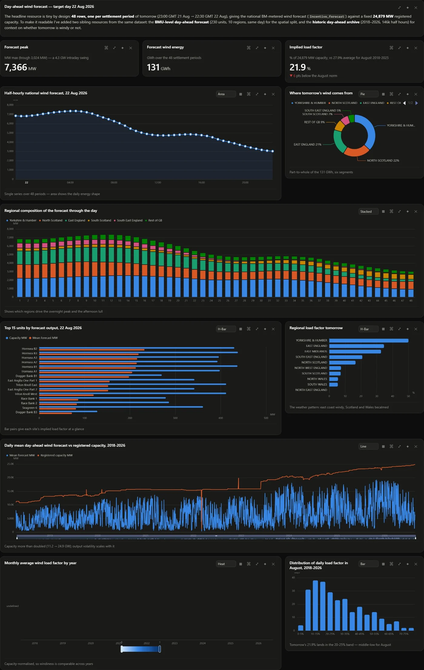
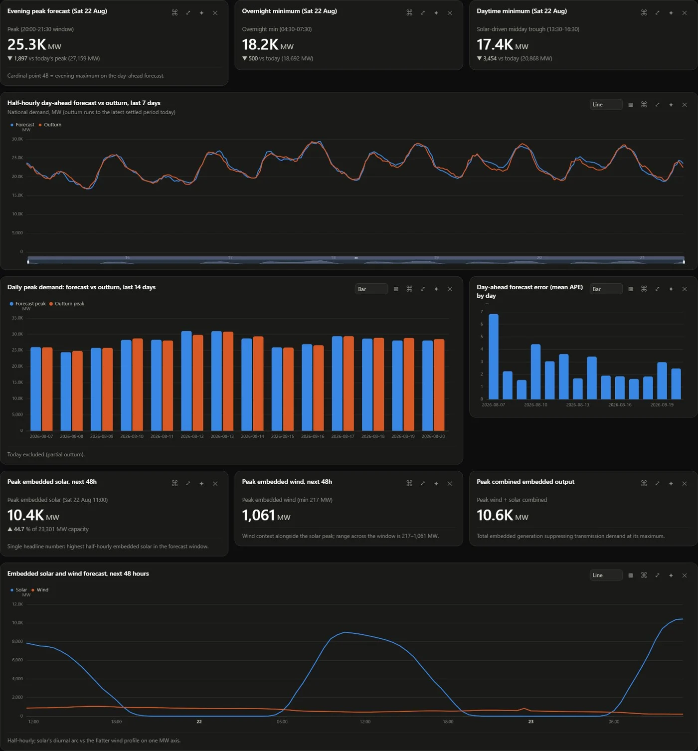
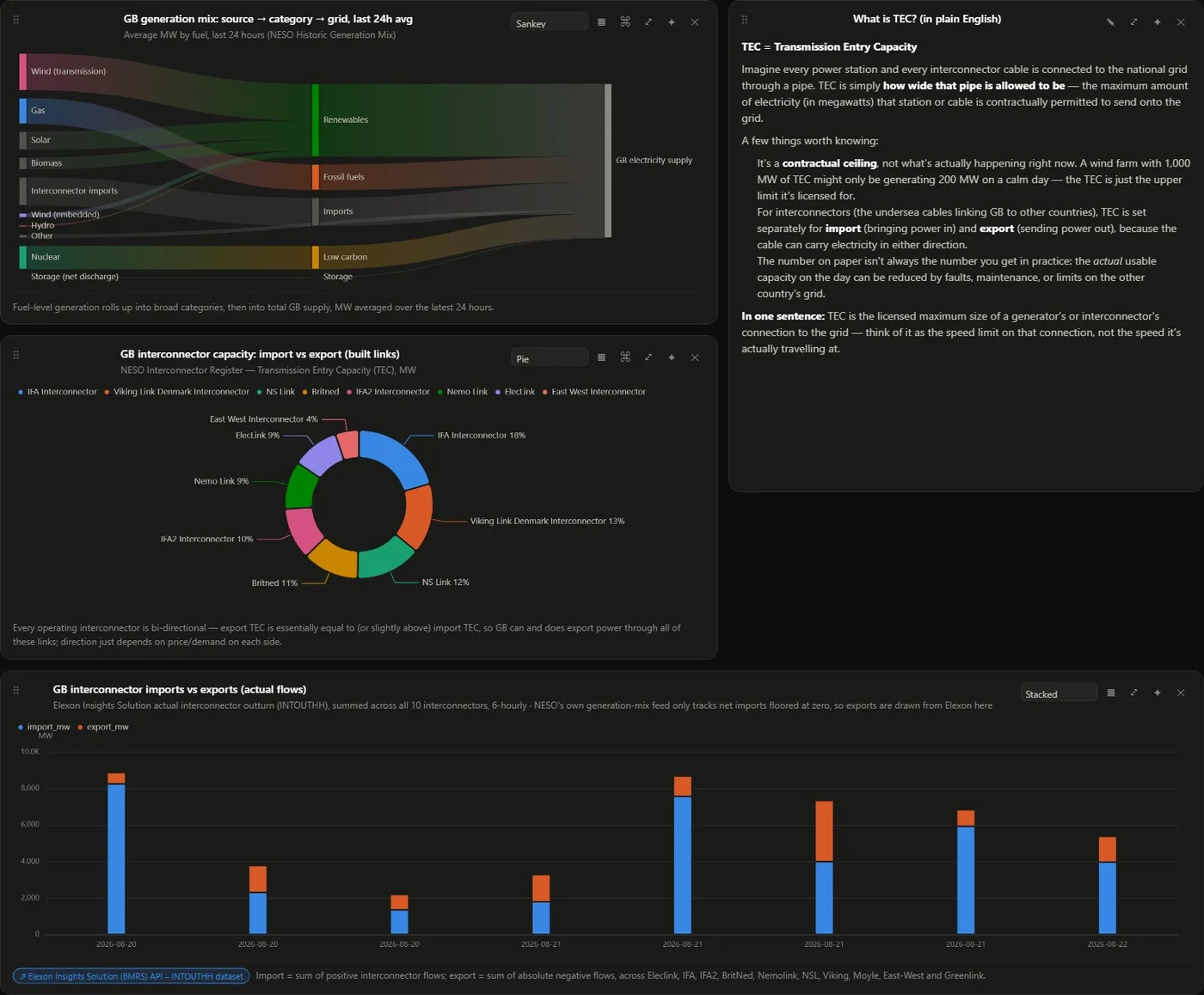
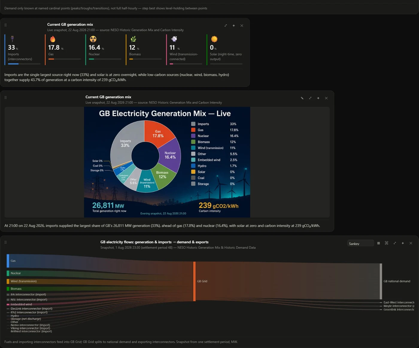
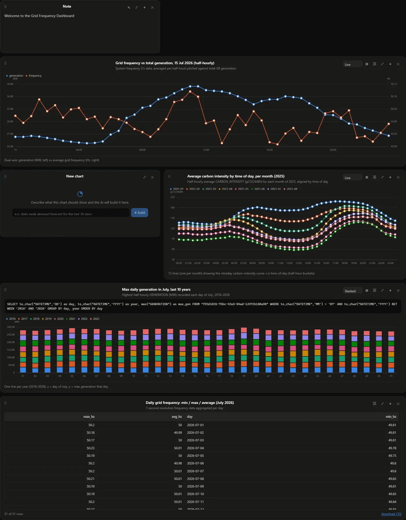
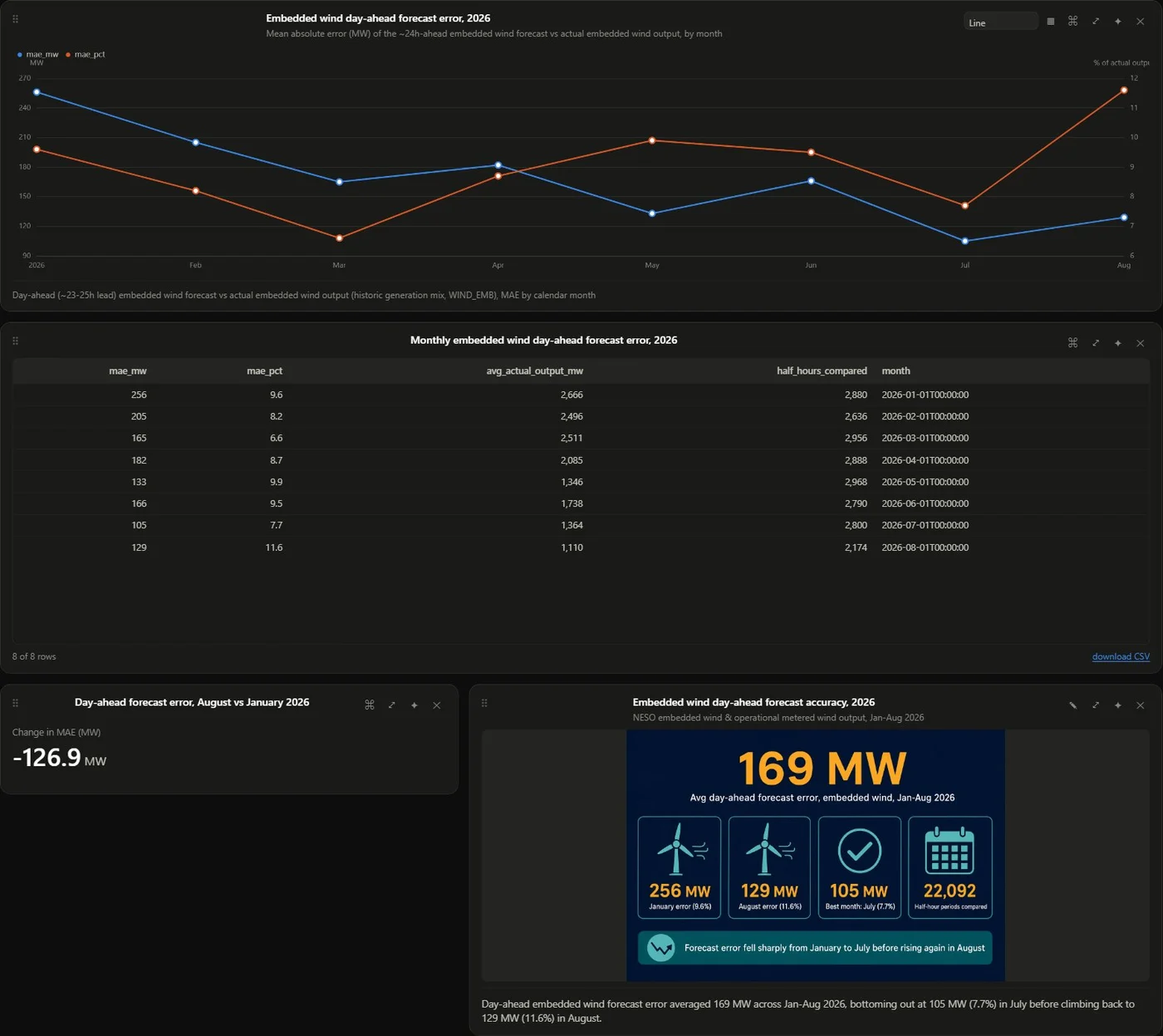
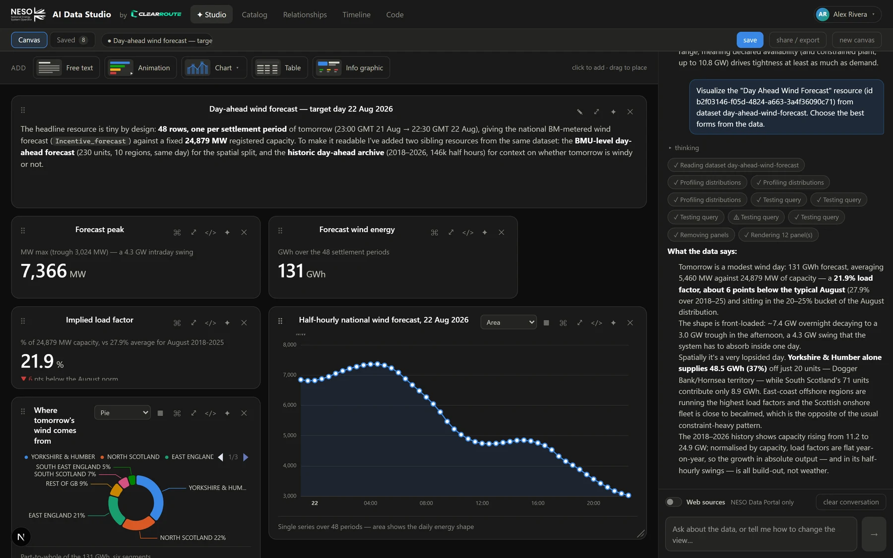
Each of these was produced in a single conversation. Click to open the full-size snapshot.
FAQ
Good questions.
What data can I explore?
Everything published on the NESO Data Portal — 129 datasets and 1,354 data files across 16 groups, covering demand and generation forecasts, balancing services and costs, carbon intensity, constraints, interconnectors, markets, FES pathways and more. Queries run against NESO's live datastore, so you always see the latest published values.
Do I need to know SQL or a BI tool?
No. You ask in plain English. The AI writes and tests the SQL and chooses a chart form from the shape of the data. If you do know SQL, every panel shows the exact query it ran — and if you would rather have a script than a dashboard, Code mode hands you real Python or TypeScript running in your own browser, or SQL sent straight to the datastore — and turns any run into curl, PowerShell or an Excel query.
How is this different from asking a general chatbot?
PowerBoard is wired directly into the datastore. It profiles real value distributions before choosing a visual, executes queries server-side, and renders interactive panels you can edit — rather than describing a chart it can't actually build from your data.
Do I have to explain myself every time?
No — you answer seven short questions once, when you join. From then on the AI knows the datasets you live in, the horizons and metrics you care about, how much industry shorthand you want and how long an answer should be. It biases what you get; it never restricts it. Ask about something completely outside your patch and you simply get an answer to the question you asked. Everything is editable from the account menu, and you can skip it entirely.
Can I share what I build?
Yes — three ways. Export the canvas as a standalone HTML page with interactive charts that anyone can open without an account. Turn it into a PowerPoint deck: the AI plans the slides, writes titles and speaker notes, and if you drop in an example .pptx the deck takes its exact branding — colours, fonts and master background are read from the file itself. Or download any panel's data as CSV or Excel, including the filtered cut a chart is showing.
What does it cost?
Exploring the data is free — the catalogue, previews, downloads and running your own code cost nothing. What you pay for is AI compute: you get free AI credits when you sign up, each AI request takes off what it cost to run, and when they run out you can buy more through Stripe — 500 credits for £5, 1,000 for £10 or 1,500 for £15. There’s no subscription, credits never expire, and a usage log shows exactly where they went.
How do I get access?
Leave your email below. We're onboarding in small groups and will send you an invite link when your seat is ready.
Already been invited? Sign in to the Studio.
Early access
Your first dashboard is one question away.
Join the early-access list and we'll email you an invite link as seats open up.
We'll only use your address to send your invite.
Already have an account? Sign in to the Studio